Setting up shop
Designing my own brand identity was a really fun project for me and one which I went to town on.
With a client brief it’s rare they give me complete free rein - there is usually some limitations to work within, but for my own brand, I had a complete free run.
Although this was initially exciting, I soon found having some limitations helpful as the vastness I had unwittingly created instantly felt a little daunting. In response I backed up and tried to think of the job as a client project.
With clients I always work from a brief so this was what I did - I wrote myself one which included everything the brand needed to achieve, what I liked and disliked, colours I’m drawn to and fonts I want to use. I then drilled down and looked at my business, my purpose, my values and why I do what I do. This really made me look at my business in a way I haven’t before. It was cathartic and helped me look at the process as if I was designing for a client.
EARLY SKETCHES
Taking the time to do research helped me form the vision of what I wanted my brand to achieve. Working mainly within print and valuing the craft so highly, I wanted my identity to reflect this. From here I jumped into my sketchbook and started sketching down some ideas.
This is how all my branding work begins - pen on paper. It’s the quickest way to flush out as many ideas as possible at the start. Having lots of ideas quickly is a good thing but I’m not ashamed to say that most at this stage are rubbish! This is just part of the process, at this stage it’s about flushing out ideas, no matter how bad they are.
Looking back over early sketches for me is when the project starts to take shape and evolve - you see your progression - almost like a visual timeline.
GOING DIGITAL
Once some initial routes were narrowed down and refined on paper, I took a selection of them into Adobe Illustrator and started creating them digitally. At this stage I’m looking to see if my drawings transfer well into logo marks - making them big and small - do they work? Are they readable or is it obvious what the mark is conveying?
Although logos were beginning to take shape, I wasn’t happy with them. When I took them down in size to say, social media icons it just wasn’t working. The text I had added around the logo felt needless so I went back and started to refine.
When I’m refining on a branding project I’m printing out each mark and putting them up on the wall, I’m asking myself if it looks right at this size? Can I read it when it’s printed on a letter? Is the font use suitable? Having a decent idea means nothing if these simple tests are not met and at this stage, my first digital logos just weren’t working. I needed a rethink.
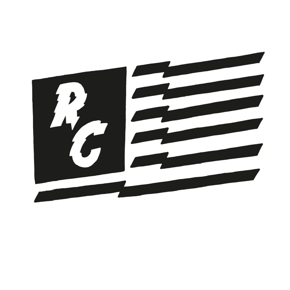
I chose to do away with about 90% of my logos and instead concentrate on an earlier idea I had come up with - a hand lettered RC logotype.
Before I had a selection of logos which never worked together, there was no logic which tied them together as a complete brand. Now, with the RC centrepiece of my logo, I could build a system of brand marks around it which did all tie together.
REFINEMENTS
Now I had a basic mark, I moved back to the refining stage. Does it scale? Is it legibility? Etc. Now I was happy. I was at the stage where I could take my time to draw out each logo mark and painstakingly refine them over time - paying close attention to letter spacing, positioning and readability.
What made this brand a little different was I wanted it to be a little imperfect and rough around the edges. I wanted to embrace the printing press and have a screen print aesthetic, a style I love - which is never perfect. Saying this, I still made sure my letters were well drawn and the spacing between them perfect!
Once the spatial relationships between them was sorted I began experimenting with different textures to give my logo the printed aesthetic I wanted. When paired with texture, it perfectly sums up the look I was after.
The icon now works at any size and forms part of a wider package of brand marks - these help lift the overall brand identity and rolls out seamlessly over brand collateral such as business cards, printed stationery and online.
CONCLUSION
Logos need to be so many things in such a small package: simple, unique, memorable, and versatile in all sizes. They also need to instantly communicate the entire feel of a brand, which is no small feat.
I’m really pleased with the final outcome of my brand, it felt like a creative journey from start to finish and it gave me a new insight into my own creative process - helping me to stop, refine, question my work and then go again.
If you have a brand identity project you think I could help you with then I would love you to get in touch with me. Email me - rich@richcstudio.co.uk


